Advisor Perspectives’ Doug Short recently published an update on margin debt, accompanied by several well-made charts. But it only takes one to make the point.
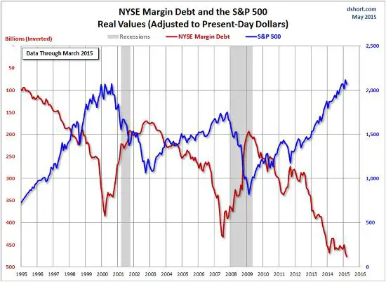
See below for the relationship between margin debt — money borrowed by retail investors against their stocks and used to buy more stock — where Short has enhanced the visual impact by inverting the margin debt line. As presented here, a downward sloping red line means margin debt is increasing. So when the two lines diverge, that means stock prices and margin debt are both rising.
The gap between them is thus a measure of the divergence between investor expectations and market reality. Note two things: 1) When the gap grows too large, the lines tend to converge via falling stock prices and shrinking margin debt (usually through involuntary liquidation of leveraged stock portfolios). And 2) Today the gap is wider than it’s ever been. If history is a valid guide, the two lines will shortly cross somewhere around 1,000 on the S&P, or about 50% lower than current levels.
14 thoughts on “Why Investors Should Be Terrified, In One Chart”
22222Ultra Income source by dollarcollapse < Find Here
So, people ought to sell at higher prices than they bought, pay off their debt and keep the profit. Those sales will tend to lower stock prices, while retiring debts reduces the margin debt. Therefore the blue and red lines above start to converge. But, if done right, didn’t the debt pay off?
The article mentions the potential risk, but not the potential upside. A key point of the article, though, is the magnitude of the current divergence shown above. Everybody can’t get out of this ahead. As always, “You got to know when to fold them, know when to walk away and know when to run…”
It’s always comforting to get the same analysis from different people. My broker’s name is Dave Long and he showed me charts that went straight up just like Doug’s does. He said everybody’s doin’ it, so I went all in on Friday. Thanks John!
i am a private lender who assist financial handicap.if you are interested.please contact me via email:davidbrownloanservice@outlook.com
Are you related to Gordon Brown ? Do you sell cheap gold ?
How do you assist in financially handicapping people ?
Important questions
are you mentally.handicap.2
“Damn the torpedoes, full speed ahead!”
Blame the jews… for real.
I am sorry, this whale cannot be slaughtered as Fed can print any amount of money. So in this case everyone lose, the market get slaughtered, market dies.
For a normal functioning market, Fed should be raising interest rate and taking the punch bowl away. As there is no sign of that, the market will continue to rise until it breaks. This is not a normal market and the whale (Fed) is in the market. Most whales take whatever the market does not want and then get slaughtered, eg Leeson, Japanese commodity trader, JP Morgan, etc.
Investors should not be terrified, they should be short.
Let’s call the dwarfs…
What, are not they short? 🙂