The Fed blew up the housing market on the way up. It is now blowing it up on the way down, and Powell starts a two-day FOMC meeting today with rate cuts back on the table.
By the DollarCollapse Editorial Team:
The S&P CoreLogic Case-Shiller 20-City Composite (SPCS20RSA on FRED) slipped to 343.00 in February 2026 from 343.16 in January, a month-over-month decline of 0.05% on a seasonally adjusted basis, the first negative monthly print of the year and the first since the brief autumn 2025 dip. The consensus call going into this morning’s 9:00 AM ET release was +0.2%. Year-over-year, the 20-city composite is now running at +0.89%, the slowest pace since the 2022 to 2023 markdown.
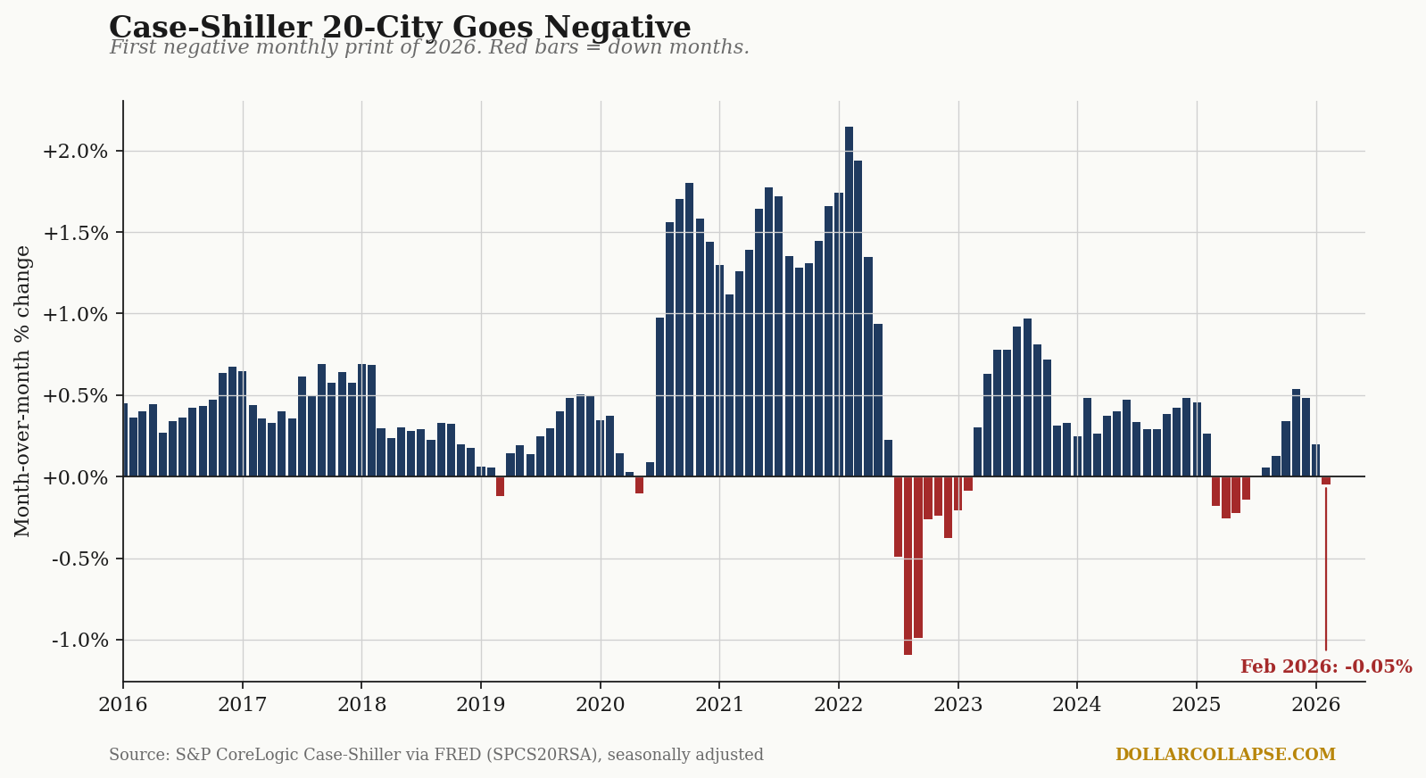
The 10-year monthly tape, charted. The 20-city composite ran red for ten consecutive months from mid-2022 through early 2023 (the post-rate-shock markdown), recovered, drifted, and has now produced its third red bar in twelve months (red in the chart). Note the sequence on the right side: the +1.5% to +2.0% prints of the 2021 to 2022 stimulus mania (blue bars at peak) collapsed into the deepest single monthly decline of the cycle, around minus 1.0% in late 2022, and the index has not put together a sustained recovery rhythm since. The latest red bar is small. It is also the third one in twelve months, after running clean blue from 2024 through most of 2025.
The index that did not crack. The Federal Housing Finance Agency’s House Price Index (USSTHPI on FRED), released the same morning at 9:00 AM ET, came in at 0.0% for February with January revised up to +0.2%, and is still running +1.7% year-over-year. Same housing market, same month, two different readings. The reason is methodological, and it matters.
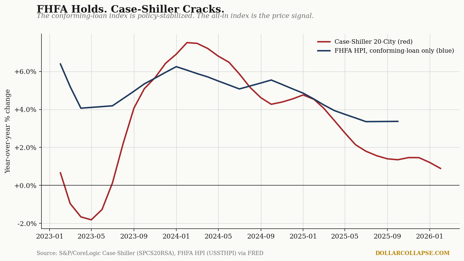
FHFA covers conforming-loan purchases only. Specifically, mortgages bought or guaranteed by Fannie Mae and Freddie Mac. The index does not see all-cash transactions, jumbo loans, or anything above the conforming loan limit. Case-Shiller covers all repeat sales of single-family homes, financed or otherwise. When the two indexes diverge (red and blue lines in the chart), the gap is the part of the housing market the GSEs do not price: the high end, the all-cash investor segment, and the jumbo-financed coastal metros. The FHFA reading is the policy-stabilized read. Case-Shiller is closer to the marginal price.
The current spread, FHFA at +3.4% YoY versus Case-Shiller at +0.9% YoY, is the widest sustained gap in three years. Read it as a signal that the high end is rolling over while the conforming-loan center holds.
Now to the cause. The 30-year fixed mortgage rate (Freddie Mac PMMS, MORTGAGE30US on FRED) printed 6.23% on the April 23 release, down from a recent peak above 7% in late 2023 but still more than double the policy-suppressed lows of 2020 to 2021. Mortgage rates and Case-Shiller YoY are inversely correlated through the relevant credit channel, with the housing-price response running on roughly an eighteen-month lag.
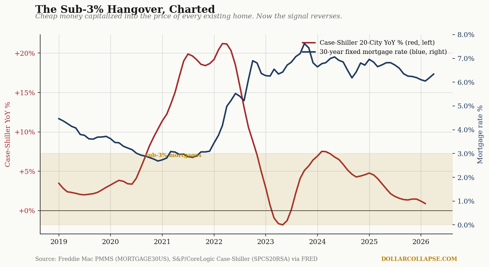
The chart tells the story Powell would prefer it didn’t. From mid-2020 through early 2022, the 30-year fixed (blue line, right axis) sat below 3.5% and briefly under 3% (the gold-shaded band). Case-Shiller YoY (red line, left axis) responded by spiking above 20%, the steepest annual home-price gain in the index’s history. The lag was real, the response was textbook, and the policy was not “lowering the cost of housing.” It was capitalizing cheap money into the price of every existing home in America, transferring forward the wealth gain to whoever already owned the asset on the day the policy fired.
Below-3% mortgages did not lower the cost of housing. They locked it in.
The Sun Belt is where the reversal is sharpest. Of the 20 metros in the Case-Shiller composite, the three pandemic-era boom markets (Phoenix, Tampa, and Dallas) tell the cleanest decomposition story. Indexed to January 2020 = 100, all three more than doubled the national pace through mid-2022. Two have now turned over month-on-month.
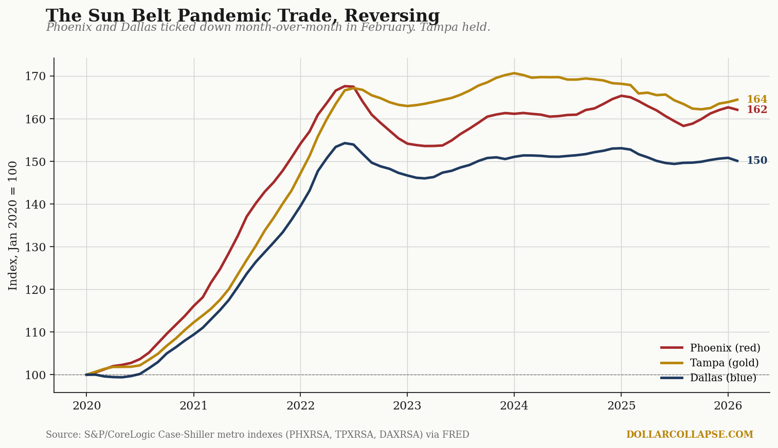
Phoenix (red in the chart) printed minus 0.35% m/m in February. Dallas (blue) printed minus 0.48%. Tampa (gold) held at +0.34%, after eighteen months of softening. The metros that absorbed the largest pandemic-era inflows are the metros absorbing the largest markdowns, and the structural read is the same in each: a housing-price level that was set by sub-3% mortgage capitalization is being repriced into a 6%+ mortgage market. The repricing is not finished.
This is a textbook Austrian malinvestment unwind. Easy money sent false price signals; builders, buyers, and lenders responded rationally to the signal; the signal is now being withdrawn, and the price level it produced is being marked down in the metros where it was strongest. Mises and Rothbard wrote down the mechanism a century ago and the only update February 2026 provides is the latest tonnage.
The political response will not be to let prices clear. The political response will be to cut rates back into the distortion. The April 28-29 FOMC meeting starts today; the statement and Powell press conference land tomorrow at 2:00 PM and 2:30 PM ET. Markets are pricing roughly even odds of a 25 basis point cut, with the longer-end probability of two cuts by year-end now back above 50%. A central bank that capitalized the housing bubble at sub-3% mortgages, then watched the markdown begin at 6%, is a central bank with one tool and a very strong incentive to use it.
The dollar’s purchasing power against housing is the variable on the other side of that decision. It usually does not get charted on FOMC day. We will be charting it on Thursday with the H.4.1.