
Guest post from John Hussman from Hussman Funds:
The extreme “tail” risk ahead may be disorienting.
We can allow for deranged monetary policy and enormous fiscal interventions. We can allow for “bit in the teeth” speculation amid historically extreme valuations. We can maintain strategic flexibility, even amid rich valuations, by responding to changes in the uniformity or divergence of market internals. No forecasts are required. Still, I remain convinced that if investors should allow for anything, it is to allow for steep losses in the S&P 500 over the completion of this cycle.
At present, we estimate that a market loss of about -30% would be required to restore expected 10-year S&P 500 total returns to the same level as 10-year Treasury bond yields; about -55% to bring the expected total return of the S&P 500 to a historically run-of-the-mill 5% premium over-and-above Treasury yields; about -60% to bring the estimated 10-year total return of the S&P 500 to a historically run-of-the-mill level of 10% annually.
The chart below may offer a sense of how far we are from Kansas, Toto. The green line shows the level of the S&P 500 that we associate with run-of-the-mill expected returns averaging 10% annually. The blue dotted line is the level we associate with a historically run-of-the-mill 5% premium over-and-above Treasury yields, and the orange dotted line shows the level of the S&P 500 that we associate with 10-year expected returns no better than those of 10-year Treasury bonds. The yellow bubbles show periods when our 10-year estimate for S&P 500 total returns was below the prevailing 10-year Treasury bond yield.
From a valuation perspective, it should not be surprising that the total return of the S&P 500 lagged the total return of Treasury bonds from August 1929 to July 1950, from December 1968 to December 1987, and from March 1998 to March 2020. Stocks don’t always outperform bonds, and starting valuations help to identify when they probably won’t.
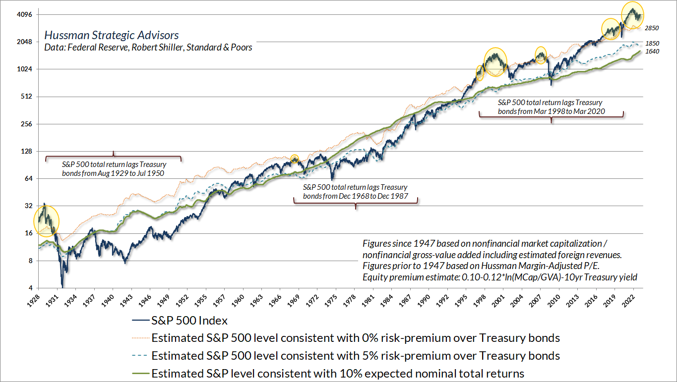
I intentionally use the phrase “run-of-the-mill” to describe potential market losses of -30%, -55%, and -60%, because none of these estimates can be considered “worst case scenarios.” Historically, market cycles typically trough at the point where prospective S&P 500 total returns are restored to the greater of a 10% nominal return or 2% above Treasury bonds, so I lean toward expecting the -60% outcome. Nothing in our discipline relies on that outcome. Still, I believe it is not only possible but likely.
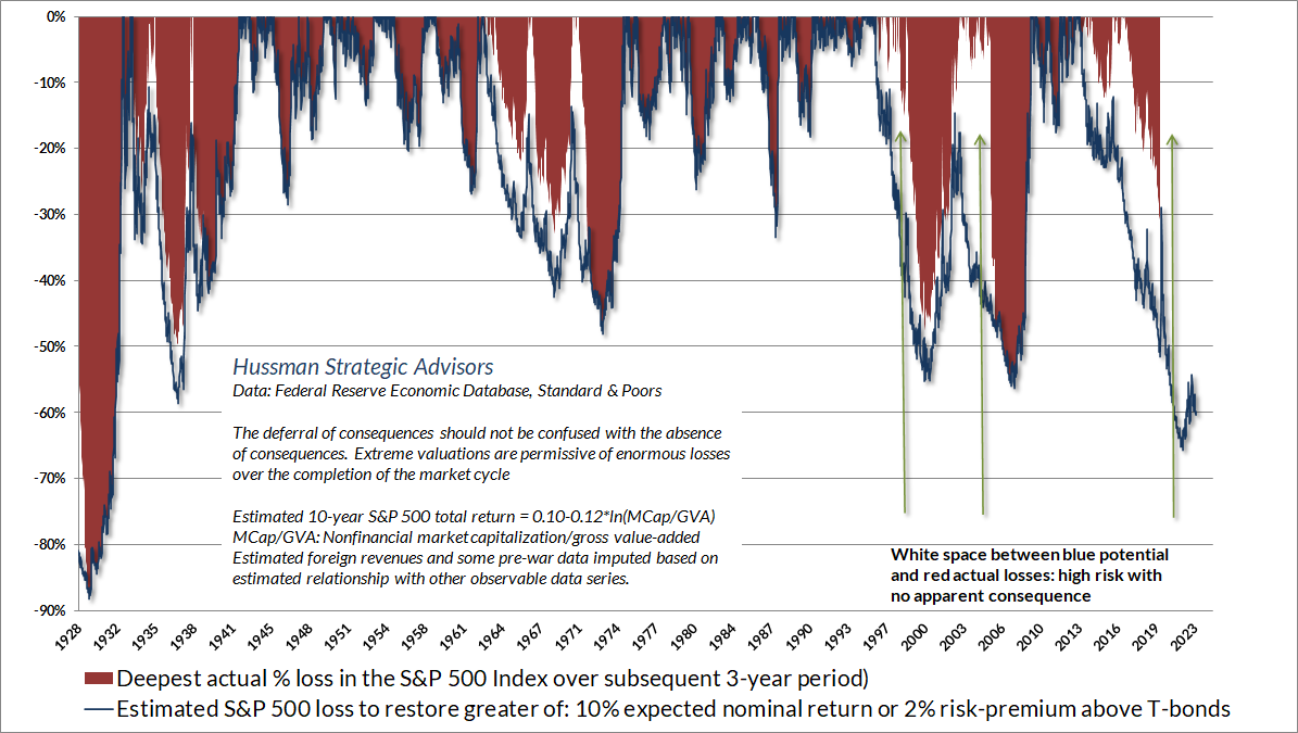
You may be quietly thinking that this entire introduction is preposterous, and that the estimates of potential drawdown are implausible. The chart below shows how reliable valuation measures have been related to actual subsequent market losses over the completion of market cycles across history. It’s important to notice that the blue “cups” are not always filled with red ink immediately. Speculative market cycles often involve extended segments with extreme valuations that then become more extreme without apparent consequence. Those segments of the market cycle are what market internals are for – we’ll talk about that shortly. Still, the deferral of consequences is very different from the absence of consequences. My concern is for investors that may discover that the hard way.
Over the past 5 years, the revenues of S&P 500 technology companies have grown at a compound annual rate of 12%, while the corresponding stock prices have soared by 56% annually. Over time, price/revenue ratios come back in line. Currently, that would require an 83% plunge in tech stocks (recall the 1969-70 tech massacre). The plunge may be muted to about 65% given several years of revenue growth. If you understand values and market history, you know we’re not joking.
– John P. Hussman, Ph.D., March 7, 2000
Just before, well, an 83% plunge in the tech-heavy Nasdaq 100 Index
No forecasts are required
In the discussion that follows, we’ll examine valuations, profit margins, interest rates, monetary policy, growth, and the composition of the S&P 500. That’s important, because all of these have been used as ways to “justify” today’s elevated valuations, and all of them are problematic. We’ll begin with updated charts and a discussion of our key measures of valuations and market internals. Following that, the progression of charts may feel increasingly brutal, because they deconstruct justifications that Wall Street repeats to investors, and that you may even repeat to yourself. I’ll limit any math to “Geek’s notes” that you can skip if you prefer.
It’s essential to emphasize, right at the outset, that nothing in our discipline relies on valuations to retreat anywhere near their historical norms. I clearly expect that they will, but we emphatically don’t rely on that. Our discipline is to align our investment outlook with measurable, observable market conditions, particularly valuations and market internals. With one important exception, that’s the same discipline that allowed us to navigate decades of previous market cycles, including the tech and mortgage bubbles and their subsequent collapses (not everyone recalls that I was a leveraged, “lonely raging bull” in the early 1990’s).
The single most important change to our discipline in recent years, as I’ve regularly discussed, is that a decade of zero interest rate policy forced us to abandon our reliance on certain “limits” to speculation, which had been reliable in every previous market cycle. My incorrect belief that speculation had a “limit” became detrimental amid the Federal Reserve’s unbridled expansion of zero-interest liquidity. Valuations and internals remain essential elements of our discipline, but we can no longer be pushed against the wall of “limits.” Reckless or not, the Fed can do what it likes. We’ll be just fine.
Valuations inform our expectations for long-term market returns and our estimates of market losses over the completion a given market cycle. But if rich valuations were enough to drive the market lower, we could never have reached the extremes observed in 1929, 2000, or early-2022. Market outcomes over shorter segments of the market cycle are driven by investor psychology. Today’s extreme valuations reflect a decade of yield-seeking speculation that drove valuations beyond every lesser extreme. Rich valuations alone aren’t enough to drive the market lower.
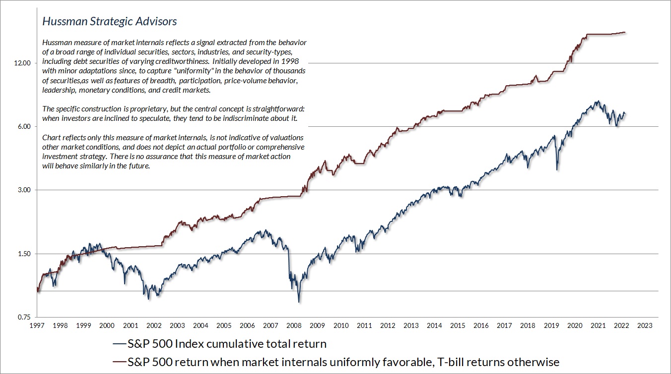
The trap door opens when rich valuations are joined by risk-aversion. We find that speculative and risk-averse psychology is best gauged by the uniformity or divergence of market internals over thousands of individual stocks, industries, sectors, and security types, including debt securities of varying creditworthiness. When investors are inclined to speculate, they tend to be indiscriminate about it. In contrast, deterioration and divergence of market internals is the hallmark of emerging risk-aversion.
We introduced our primary measure of market internals in 1998, with only minor adaptations since. The chart below presents the cumulative total return of the S&P 500 in periods where our measures of market internals have been favorable, accruing Treasury bill interest otherwise. The chart is historical, does not represent any investment portfolio, does not reflect valuations or other features of our investment approach, and is not an assurance of future outcomes.
Although some shifts in market internals are short-lived “whipsaws” and some shifts persist for well over a year, it’s typical for market internals to shift about twice a year. We don’t use internals in an attempt to “time” or “catch” short-term market fluctuations. Rather, internals are best used as a gauge of speculative versus risk-averse investor behavior, and we respond to shifts in combination with valuations, as well as other useful though less essential considerations.
When we abandoned our reliance on historical “limits” to speculation several years ago, we gave increased priority to our gauge of market internals. That should be increasingly evident since 2019. So even as we examine the risk of a -60% market collapse below, keep in mind that valuations are only part of our investment discipline. If investors shift back to speculative psychology, market internals will be among the elements that preserve our flexibility, even in the unlikely event that valuations remain elevated indefinitely.
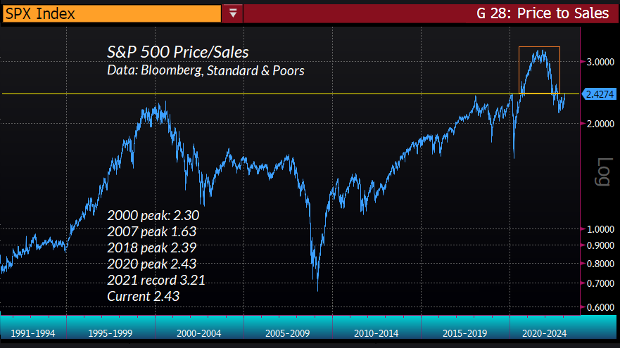
On the valuation front, it’s tempting to imagine that the market decline in 2022 has eliminated the overvaluation produced by a decade of yield-seeking speculation, leaving the market at the beginning of a new and sustainable bull market. We wouldn’t rule out a period of speculation if our measures of internals were to improve, but from a valuation standpoint, the chart below shows the present reality. The 2022 decline did nothing but remove the most extreme froth from valuations, leaving the price/sales multiple of the S&P 500 above the level it reached at the 2000 bubble peak, and at the same level observed at market peaks in 2018 and 2020. To expect an extended market advance from here is essentially to view the area in the red box as the “new normal,” and to dispense with all of market history before late-2020.
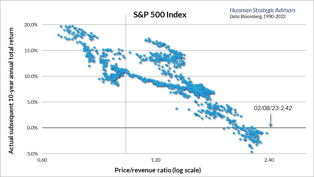
The chart below shows the relationship between the S&P 500 price/revenue ratio and actual subsequent S&P 500 10-year returns, in fairly recent data, from 1990 to the present.
The next chart reflects more extensive data from 1928 to the present. MarketCap/GVA is the ratio of nonfinancial market capitalization to corporate gross value-added, including estimated foreign revenues – our most reliable valuation measure, based on its correlation with actual subsequent market returns in market cycles across history. The scatter shows MarketCap/GVA on log scale, versus actual subsequent 12-year S&P 500 total returns. Presently, our expectation for 12-year market returns remains negative.
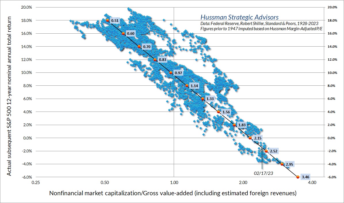
It’s not surprising that the chart above looks much like the scatter for the S&P 500 price/sales ratio. Our most reliable valuation measures, including MarketCap/GVA and our Margin-Adjusted P/E (MAPE) are just broad apples-to-apples price/revenue ratios.
We’ll get to the “but, margins” justification shortly, but the fact that the relationship between valuations and returns has remained stable over a century of market cycles should already give you a hint that justifying rich valuations based on elevated profit margins is problematic. Indeed, those who insist on valuing stocks using price/earnings multiples would do well to understand that the combination of high profit margins and high P/E ratios tends to be disastrous. As I observed in February 2022, paying a high price/earnings ratio, based on earnings that are already elevated by high profit margins, amounts to paying top dollar for top dollar. That is exactly what investors have done in recent years, and what they are still doing today.
The green line in the chart below shows the level of the S&P 500 that we estimate would be associated with a historically run-of-the-mill long-term return of about 10% annually. The blue line shows the S&P 500 Index, and the red “stairstep” shows levels of the S&P 500 that proved to be “durable” in the sense that they were not violated in subsequent market declines. You’ll notice that advances in the S&P 500 toward the green valuation norm tend to be durable, while advances far beyond the green valuation norm tend to be transient. We don’t actually know what the current “durable” level will be, but based on historical experience, it is set at the current level of that green valuation norm.
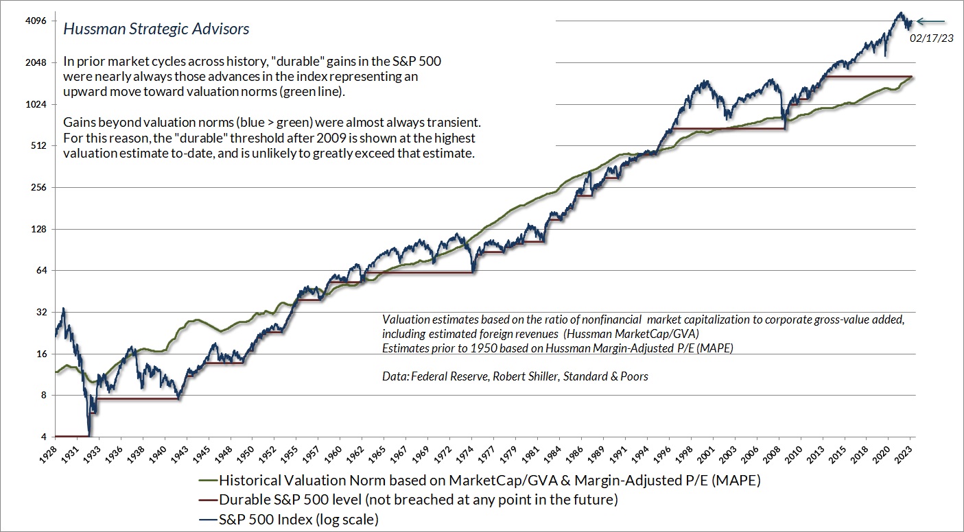
As I observed during the technology bubble, and also just before the global financial crisis, we find that these historical norms tend to provide useful estimates of potential downside market risk over the completion of any given market cycle. The quote below is from a comment I wrote in April 2007.
Essentially, that green line is a fairly robust estimate of where the S&P 500 would have to trade in order for stocks to be priced to deliver long-term returns of 10% annually. Where is that green line today? 850 – about 40% below current levels. Again, that doesn’t imply that stocks have to actually suffer a decline of that magnitude. It’s just that investors should not expect the S&P 500 to reliably deliver long-term returns of 10% annually or better until it does. You’ll note that there are also points in history when the S&P 500 traded substantially below that 10% valuation line. Those were points where stocks were priced to deliver long-term returns reliably above 10% annually, and in fact, they did exactly that. Presently, we’re not anywhere close to such a situation.
For now, investors still seem willing to tolerate ‘price to forward operating earnings’ multiples that are extremely elevated, because they don’t even realize that these multiples are extremely elevated. These are all notions that will be disabused over time. We don’t rely on investors waking up overnight. But we also are not willing to gamble our financial security on short-term hopes that the speculative mood will persist.
– John P. Hussman, Ph.D., Fair Value – 40% Off (Not A Forecast, But Don’t Rule It Out), April 2007
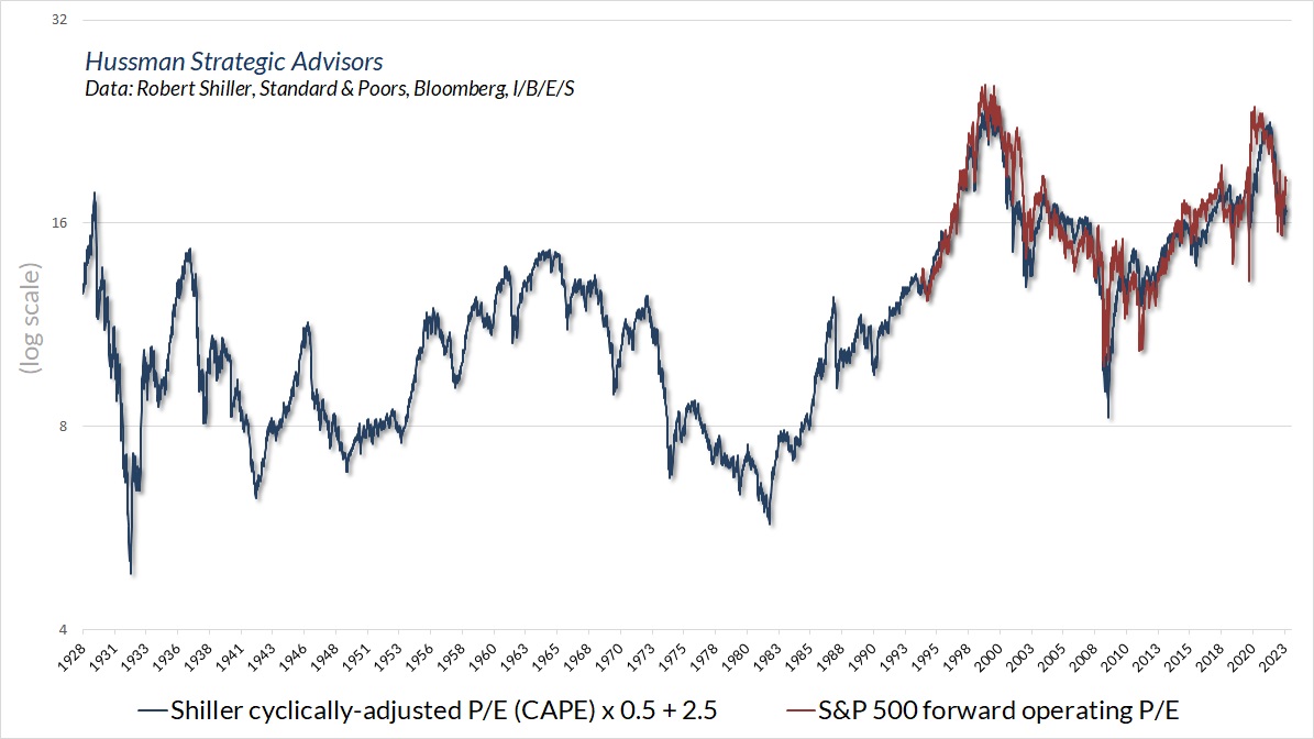
While we find measures like MarketCap/GVA, MAPE, and even price/revenue to be more reliable than earnings-based measures, the main consideration for any valuation ratio is to choose a denominator that is representative and proportional to very, very long-term cash flows. Even the Shiller Cyclically-Adjusted P/E (CAPE) does a serviceable job in this regard.
Meanwhile, the best we can say about year-ahead forward operating earnings estimates is that analysts tend to “look beyond” short-term economic fluctuations, making forward earnings less volatile than year-to-year reported earnings. Unfortunately, as I’ve noted before, forward operating earnings only became popular on Wall Street in the early 1980’s. As I observed in 2007, before the global financial crisis, investors seem willing to tolerate extremely elevated “price to forward operating earnings” multiples because they don’t even realize how elevated these multiples are.
On this point, it turns out that the price/forward earnings multiple and the Shiller CAPE (which has a far longer history) are well correlated. Based on the estimated relationship between the two, it’s easy to see that a historically “normal” level for the S&P 500 price/forward operating earnings multiple is only about 11.
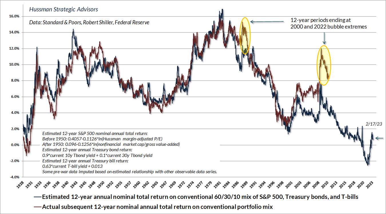
The chart below shows our estimate of likely 12-year average annual total returns for a passive investment portfolio allocated 60% to the S&P 500, 30% to Treasury bonds, and 10% to Treasury bills. Presently, this estimate is less than 1% annually. Needless to say, we prefer a value-conscious, hedged-equity discipline. Frankly, we even prefer Treasury bills, to a significant exposure to market risk. That will change as market conditions do. As I’ve often noted, the strongest market return/risk profiles typically emerge when a material retreat in valuations is joined by an improvement in the uniformity of market internals. Presently we observe neither.
When “errors” are information
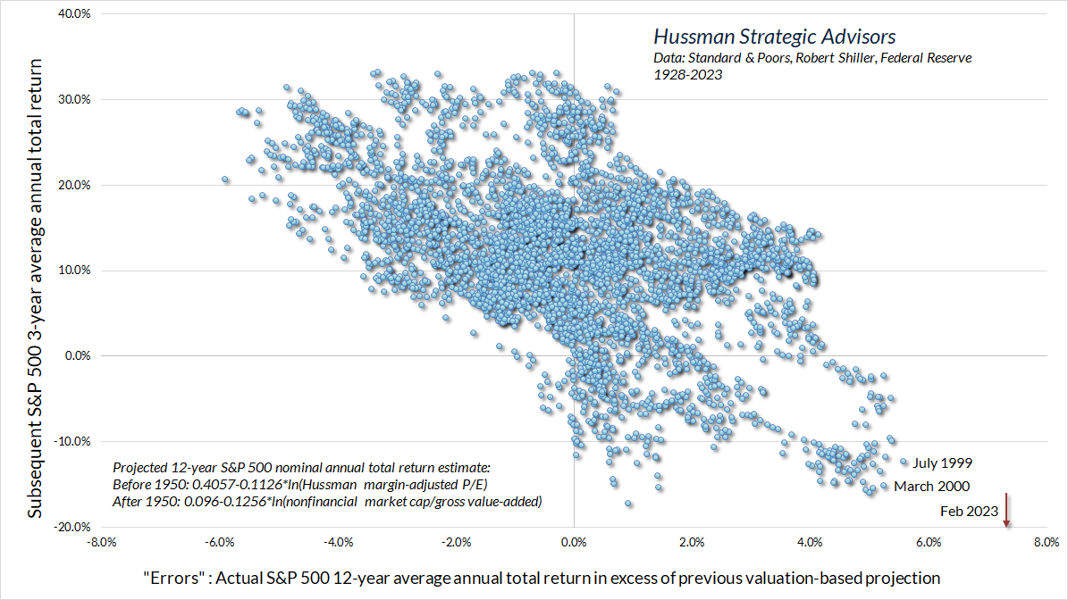
There are certainly periods, like the recent bubble, that produce meaningful “errors” between projected returns and actual subsequent returns. It’s tempting to interpret these “errors” as evidence that valuations don’t work. To the contrary, these errors generally occur at points where the end of a particular investment horizon represents the peak of a bubble or the trough of a collapse. As a result, the “errors” themselves are informative about subsequent market returns. They have a correlation between -0.6 and -0.7 with actual subsequent market returns as much as 12 years later. The reason is simple: speculative advances or market collapses that take valuations far beyond their norms tend to be followed by subsequent collapses or recoveries toward those norms.
In the chart below, we define a projection “error” as the difference between the actual S&P 500 total return over a given 12-year horizon and the total return that could have been projected based on starting valuations at the beginning of each horizon. Prior to the recent bubble, the largest “errors” occurred in July 1999 and March 2000. The current “error” is shown by the red arrow, reflecting more than a decade of Fed-induced, yield-seeking speculation that drove actual returns away from valuation-based norms. We don’t know yet what the total return of the S&P 500 will be over the coming 3-year period, but you already know that I would not be surprised by a 3-year period of -20% average annual losses.
False justifications
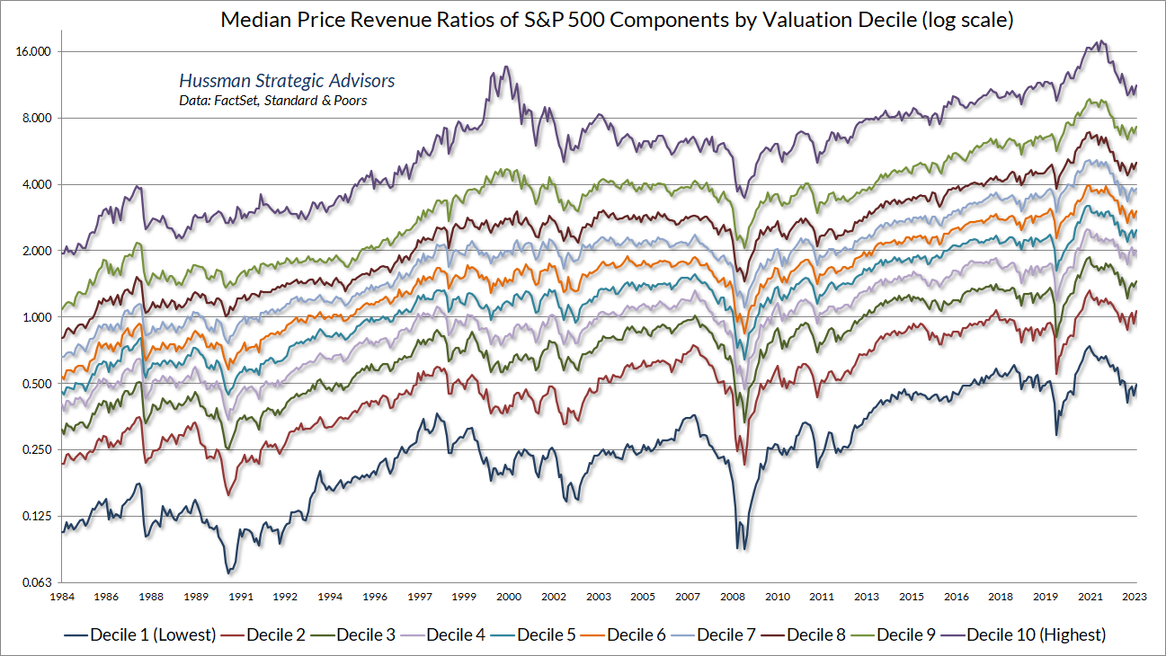
Several arguments are typically offered in defense of current speculative extremes. One suggestion is that these extremes are driven by high price/revenue multiples among the very largest companies like as Apple, Google, and Microsoft, that deserve those valuations due to high profit margins. The difficulty with this argument is that even when components of the Standard & Poor’s 500 Index are sorted by their price/revenue multiples, the median valuation of every subset has exceeded its 2000 extreme in recent years, from the 10% of components with the lowest multiples to the 10% with the highest multiples. The same is true when S&P 500 components are sorted by market capitalization.
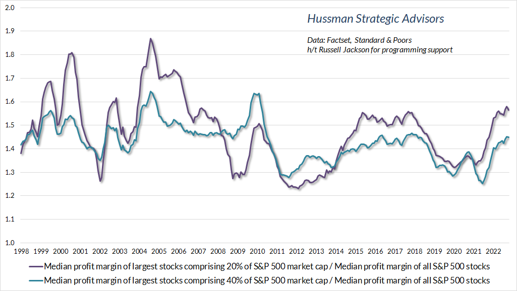
A similar proposal is that perhaps revenue-based valuation measures are biased, relative to history, by mega-cap companies with unusually high profitability. Yet when the components of the S&P 500 are sorted by market capitalization, the median profit margins of the largest stocks comprising 20-40% of S&P 500 market capitalization are no higher, relative to the median S&P 500 component, than has been typical over the past two decades.
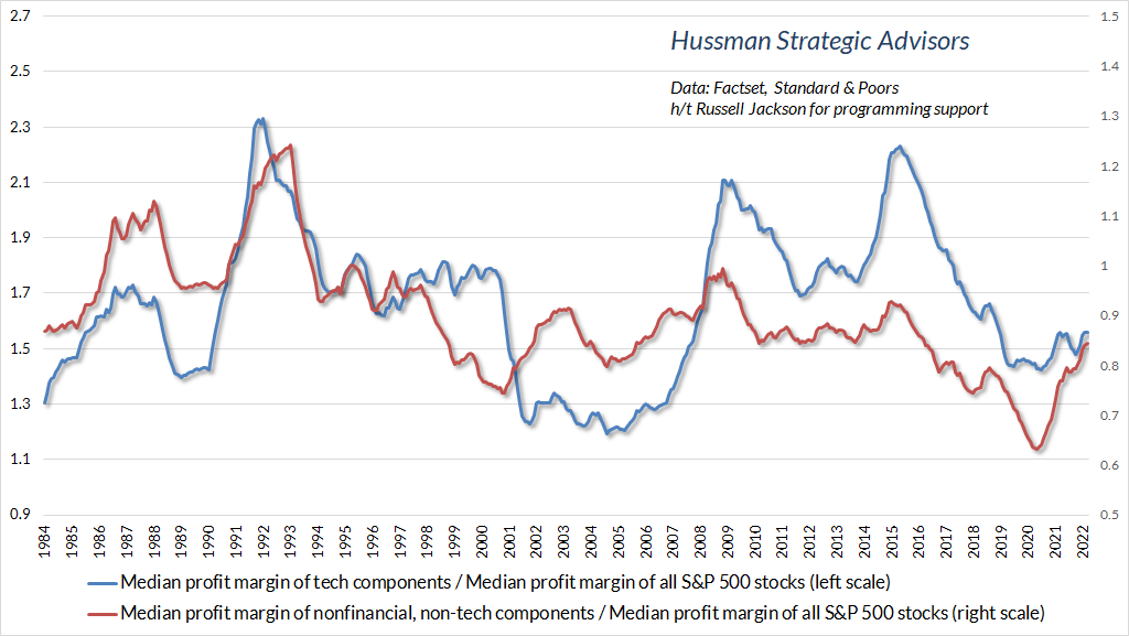
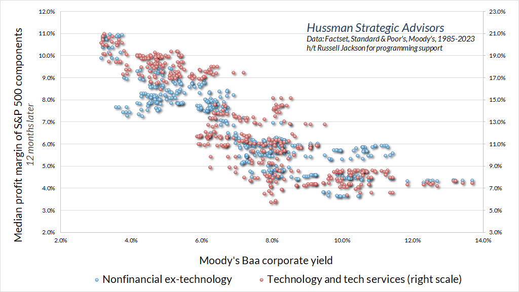
Another argument is that improved profit margins in the technology sector justify elevated price/revenue multiples (and by extension, MarketCap/GVA, our Margin-Adjusted P/E, and similar gauges). Yet while the profit margins of technology companies are generally higher than the median S&P 500 component, and those profit margins fluctuate considerably over time, the profit margins of technology companies in the S&P 500 have not materially increased relative to the median profit margin of S&P 500 components in recent decades.
In short, the rich valuations we observe in the U.S. equity market are not the artifact of a handful of companies, nor have the largest companies become significantly more profitable in recent years, relative to other S&P 500 components.
It is true that the general level of corporate profit margins has been higher, across the board, than in 2000, but three clear macroeconomic drivers account for nearly all of that difference, and none are permanent.
First, when the cost of labor required to produce a given unit of output grows more slowly than the price of that unit of output, profits tend to increase. So profits move opposite to real unit labor costs. For several years following the 2008-2009 global financial crisis, profit margins enjoyed a significant boost due to depressed real unit labor costs – a boost that has been gradually reversing since 2014. As we observed in 2007, profits can “pop” near the end of an economic expansion if consumers run down their saving. In 2007, this “dissaving” was largely financed by home equity withdrawals amid a mortgage bubble. In recent years, consumers have run down the surpluses they accumulated as a result of pandemic subsidies. Still, prevailing labor costs suggest that the resulting “pop” in corporate profits is unlikely to be sustained.
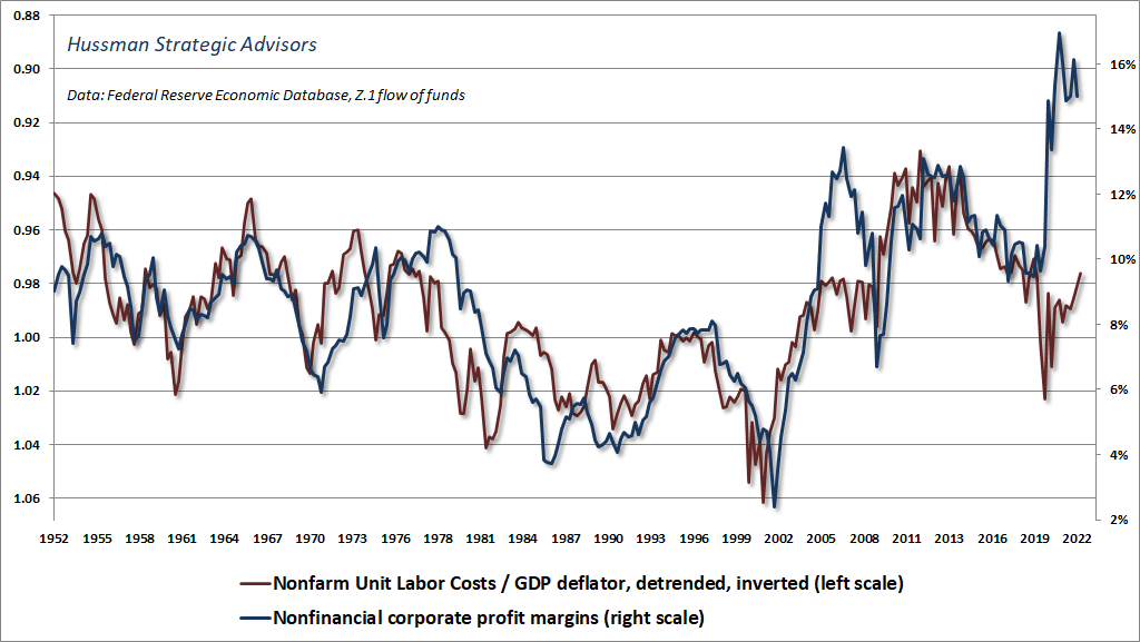
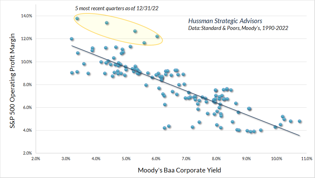
Second, low interest rates also helped to boost profit margins during the past decade. Economy-wide corporate interest costs closely track Baa corporate bond yields. Given that nonfinancial corporate debt is nearly the same size as nonfinancial corporate revenue, each 100 basis point decline in Baa corporate yields tends to reduce interest costs and boost profit margins by that same 100 basis points. This driver has sharply reversed in recent quarters, as the level of Baa interest rates moved from 3.3% to 5.6% in 2022.
The chart below shows the relationship between the Baa corporate bond yield and the S&P 500 operating profit margin. Notice that past few quarters were distinct outliers, largely due to dissaving in other sectors. As a side note, the word “operating,” as typically applied to earnings releases and P/E ratios, refers to “income from continuing operations” (basically earnings without the bad stuff), not the accounting definition of “operating profit,” which excludes interest and taxes.
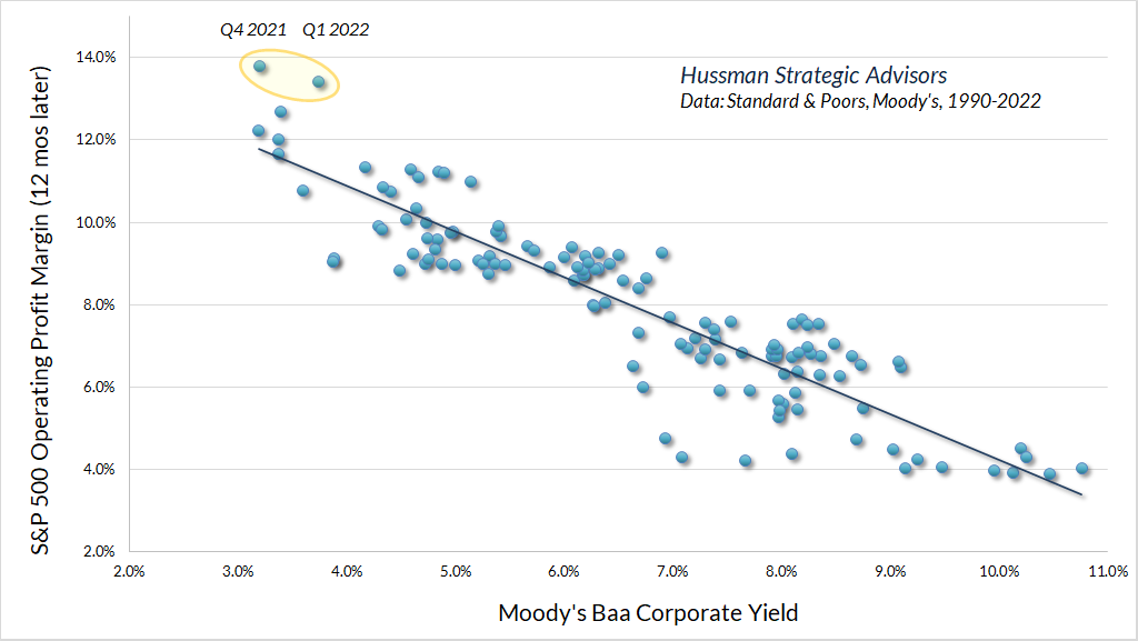
Given that higher bond yields can impact corporate profit margins with a lag, we observe an even stronger relationship between the Baa corporate yield and the S&P 500 operating profit margin one year later. With a Baa yield of 5.6%, the implied profit margin is closer to 9% than the recent 14%. Given S&P 500 index revenues at 1750, a 9% profit margin corresponds to operating earnings of about $157.50.
Notably, technology margins are affected by interest costs just like the margins of other S&P 500 component companies.
In short, the behavior of S&P 500 profit margins is not driven by hand-wavy “new economy” dynamics, as much as the talking heads may wax rhapsodic with bafflegab about “mass collaboration and cross-functional mindshare enabled by extensible technology and global meta-service networks.”
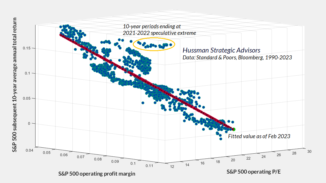
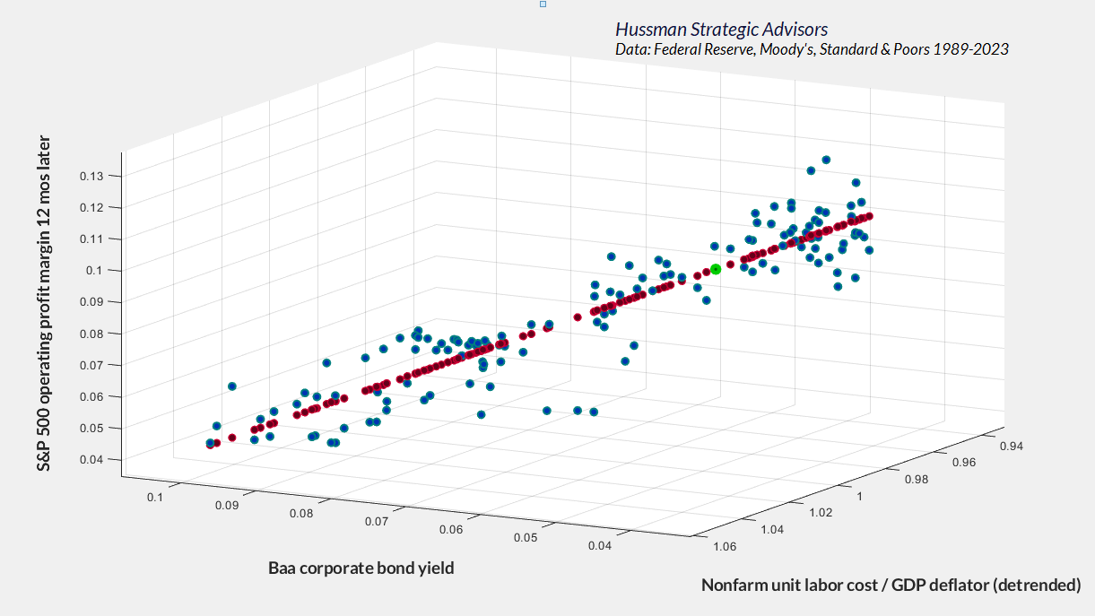
No. The drivers are wholly pedestrian, macroeconomic factors – primarily labor and interest costs. Both have been depressed over the past decade, and they are no longer at such extremes. The chart below shows their impact in three dimensions. The S&P 500 operating margin implied by current labor costs and Baa yields is shown by the green dot.
Finally, trillions of dollars in deficit spending caused a sharp but temporary boost in the income and savings of other economic sectors, as every deficit of government must be matched by a corresponding surplus in household, corporate, and foreign saving. This is not a theory but an accounting identity. Unless one expects multi-trillion dollar pandemic deficits to become the norm, this recent driver of corporate profits should not be viewed as sustainable.
It is dangerous and almost superstitious to take the bloated profit margins and corporate earnings of recent years at face value, and to value equities on that basis. The failure of profit margins to maintain a permanently high plateau could have very unpleasant consequences in a market where the price/revenue ratio of the S&P 500 is currently near 2.4, compared with a historical norm of less than 1.0.
Rear-view growth
Examine the record of, say, the 200 highest earning companies from 1970 or 1980 and tabulate how many have increased per-share earnings by 15% annually since those dates. You will find that only a handful have. I would wager you a very significant sum that fewer than 10 of the most profitable companies in 2000 will attain 15% annual growth in earnings-per-share over the next 20 years.
– Warren Buffett, Berkshire Hathaway 2000 Chairman’s Letter
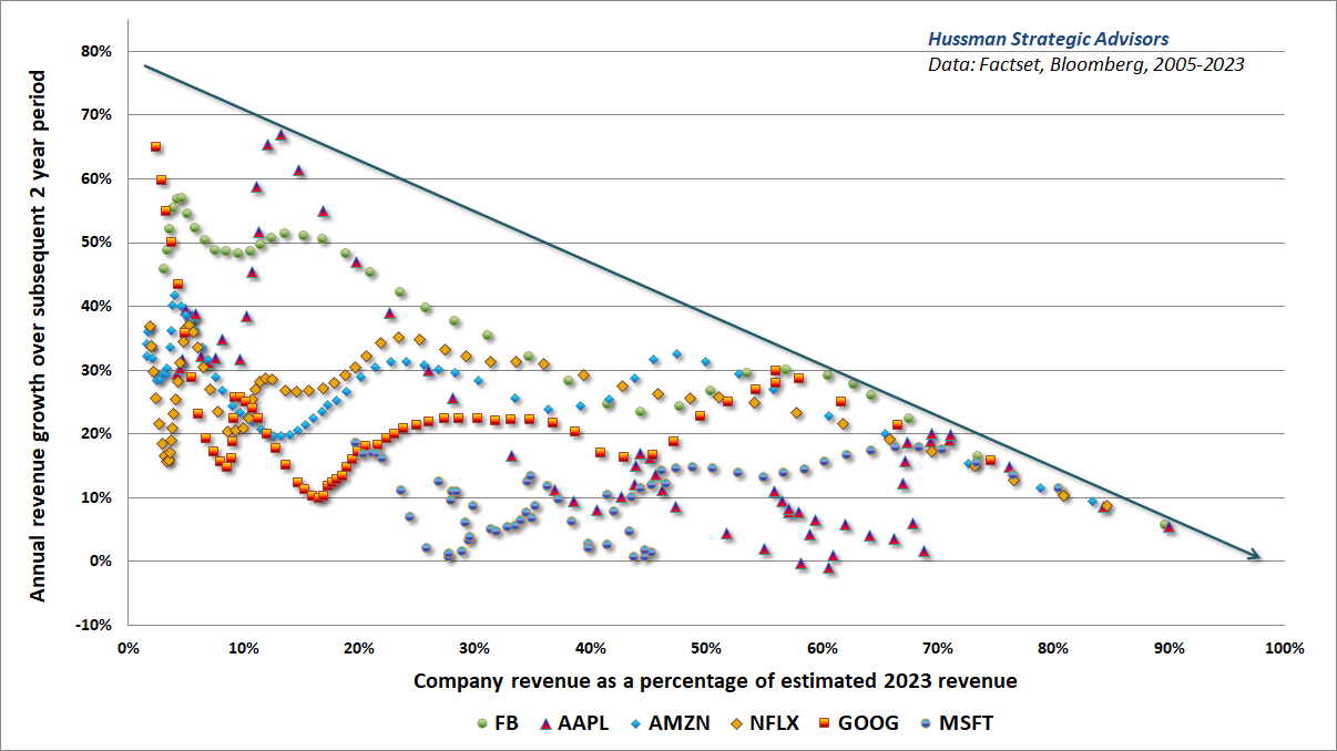
If you examine the largest components of the S&P 500 at any point in history, you will always find a handful of companies with enormous market capitalizations, that have enjoyed remarkable growth in the preceding decades. Investors have the tendency to extrapolate the growth of these companies, and to assign them enormous valuation multiples. Because the U.S. economy has been dynamic, the industries represented by the largest companies often change, leading investors to imagine that each time is the first time such large companies have ever dominated the market. The reality is that the “new economy” is a very old story, and extrapolating the past growth rates of already enormous companies typically ends in tears.
Warren Buffett’s observation is instructive. As it happened, only two of the 200 top-earning companies in 2000 went on to enjoy annual earnings growth of over 15% in the 20 years that followed. Apple – #168 on the list – enjoyed earnings and revenue growth in excess of 20% annually. United Healthcare – #180 on the list – enjoyed earnings growth of nearly 20% annually, though revenue growth fell short of 15%. Notably, while Amazon enjoyed revenue growth of nearly 30% annually between 2000 and 2020, the company had no earnings in 2000, and its $1.6 billion in revenues were just 1% of Wal-Mart’s.
The perennial lesson for investors is that rapid and sustained growth generally emerges from a low base, not from an enormous one. The most rapid growth rates are typically associated with emerging leaders in emerging industries. It is likely a mistake to expect rapid growth from companies that have already matured to the point of market saturation. It is also a mistake to assign rich price/earnings and price/revenue multiples to those already mature fundamentals.
Geek’s note: If the growth rate of a given industry is r and the market share of a given company increases by a factor of X over a period of T years, the annual growth rate of that company will be g = (1+r)*X^(1/T)-1. For example, if an emerging industry grows by 15% annually over a 10-year period, and an emerging leader in that industry triples its market share over that time, the company’s annual growth rate will be (1.15)*3.0^(1/10)-1 = 28.35%.
A company that already has a dominant market share in an already mature industry is unlikely to enjoy the explosive growth that an emerging leader in an emerging industry often enjoys. Yet investors extrapolate the rear-view growth of the largest companies anyway. The chart below, featuring “glamour growth stocks” of the recent market bubble mirrors a chart that I used to demonstrate this same point about glamour growth stocks in 2000.
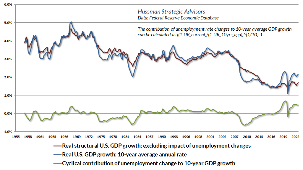
With regard to broader economic growth, it is important to recognize that while technology and productivity growth are important drivers of economic activity and living standards, the rate of U.S. productivity growth has actually slowed markedly in recent decades, as has the rate of demographic labor force growth. The sum of those two growth rates is what we describe as “structural” economic growth. The observed growth rate of real U.S. GDP is the sum of that “structural” component and a “cyclical” component driven by shorter-term fluctuations in the rate of unemployment.
The chart below shows how U.S. economic growth can be partitioned into these structural and cyclical components. The structural component is currently growing at only about 1.7% annually. Real economic growth substantially above that level would rely on a further decline in the rate of unemployment, currently at 3.4%.
On interest rates and recession risk
When the time comes to ask the question – ‘What triggered the crash?’ – remember that this is the least important question. The important question to ask is ‘What drove the bubble?’ That’s where the lessons will be. The most egregious role will be assigned to the Federal Reserve.
For more than a decade, the mountain of zero-interest base money created by the Fed has burned a painful hole in the psyche of investors. Every dollar of base money (bank reserves and currency) must be held by someone until the Fed retires it, but each holder feels that they have to get rid of it, so they pass the hot potato to someone else. Unfortunately, not a single dollar goes ‘into’ the stock market without simultaneously coming ‘out’ in the hands of a seller. So the cycle repeats. The desperate yield-seeking chase for alternatives to ‘zero’ has driven financial markets to extreme valuations, so that they, too, have become priced for dismal (and even negative) future returns.
From these extremes, one doesn’t need to anticipate the ‘catalyst’ that will trigger a crash. All one needs to know is that speculative psychology is impermanent, and that a market collapse is nothing but risk-aversion meeting a low risk-premium.
Meanwhile, when you hear people say that market valuations are ‘justified’ by low interest rates, what they mean – whether they realize it or not – is that dismal future returns on bonds ‘justify’ dismal future returns on stocks. The fallacy is in thinking that somehow the extreme valuations will not, in fact, be associated with dismal returns. That’s simply magical thinking, and it has nothing to do with asset pricing.
– John P. Hussman, Ph.D., What Triggered the Crash?, July 2021
Among the most repeated phrases on Wall Street during the past decade is the assertion that “low interest rates justify high valuations.” The problem with this phrase is that it is treated as a “hall pass” to justify mindless speculation – ignoring any consideration about the extent of those high valuations, or the consequences of those high valuations.
Now, it’s true that for any set of future cash flows, the higher the price investors pay, the lower the returns they can expect. If interest rates are low, and the future cash flows are unchanged, then it makes sense to price stocks for lower future returns as well. That’s exactly what the “high valuations” do. In other words, to say “low interest rates justify high valuations” is identical to saying “low interest rates on bonds justify low future returns for stocks.” Nobody ever actually says that, because it sounds unappealing – and it should.
While there’s certainly not a one-to-one correspondence between interest rates and market valuations, low interest rates do tend to accompany rich stock market valuations. But those rich stock market valuations, in turn, are also associated with low or dismal subsequent market returns. Again, the function of the “high valuations” is to drive future stock returns to levels commensurate with the low interest rates. Unfortunately, investors may stop asking “how high,” ignoring the extent of overvaluation. In those situations, the likely total return of the S&P 500 can be driven not only to levels that compete with interest rates, but to zero or negative levels.
The chart below shows this dynamic in data since 1928. To assist in “reading” this three-dimensional chart, look first at the vertical axis, which measures the 12-year total return of the S&P 500. Now look at the axis on the bottom left. That axis shows the level of 10-year Treasury bonds, ranging from 14% down to 2%. Notice that lower interest rates are generally associated with lower subsequent S&P 500 total returns. Why is that true? Well, look at the axis along the bottom right. The points associated with low interest rates are generally accompanied by high levels of valuation and poor subsequent market returns. In contrast, the points associated with high interest rates are typically accompanied by low levels of valuation and glorious subsequent market returns.
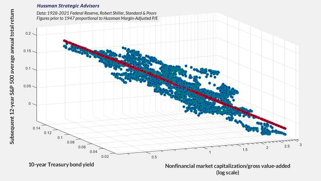
Put simply, low interest rates may be the “friends” of investors in the rear-view mirror, because they tend to encourage an advance to rich market valuations. But those rich valuations also have consequences. Moreover, notice that there is a section of the plot where subsequent market returns were below zero. The returns were below zero precisely because investors told themselves “low interest rates justify high valuations,” but failed to ask “how high.” Presently, our estimates for likely S&P 500 total returns are negative on both a 10-year and a 12-year horizon. A sharp retreat in valuations could, and I expect will, change that over a much shorter period. Until that occurs, the market will continue to face substantial downside risk – particularly in periods when divergent market internals suggest risk-aversion among investors.
On the subject of risk aversion, it will be increasingly important to monitor low grade credit in the months ahead. As noted earlier, the impact of higher interest rates tends to hit corporations with a lag of about a year or more, as existing debt comes up for refinancing. We already observe emerging economic strains, and though we would require more weakness in the employment figures before projecting an economic recession with high confidence, employment figures tend to lag other economic data.
Already, we’re seeing increasing announcements of job cuts among corporations. Investors have tended to reward those announcements with knee-jerk advances in stock prices, on the notion that lower employment costs mean higher profits. A difficulty is that these layoffs reflect what economists sometimes call the “tragedy of the commons” – what seems to be a beneficial action for any individual in the economy can have awful outcomes if everyone else does the same thing.
My impression is that the U.S. economy will be in recession by mid-year. Given the conditions already in place, even a modest increase in the rate of unemployment to about 3.8% would be sufficient to trigger our Recession Warning Composite. While stock market weakness often precedes recessions, the lead time is typically only a few months. A recession beginning about mid-year would place the market in a window of vulnerability here and now. Still, nothing in our discipline relies on that outcome. As usual, no forecasts are required, and we’ll align our investment outlook with observable market conditions as they change over time.
While investors will undoubtedly blame the Federal Reserve for a recession, and already blame the Fed for recent market losses, it’s actually the decade of deranged zero-interest monetary policy that deserves blame. Based on prevailing levels of nominal GDP growth, the GDP output gap, unemployment, and core inflation, the current level of Treasury bill rates is still well below what most systematic policy benchmarks would suggest. The Federal funds rate is still below year-over-year core CPI inflation. The Fed has never cut rates in this situation except when inflation has been below 3% or unemployment has been greater than 5% (even the single instance below a 6% unemployment rate was short-lived). Meanwhile, the recent loss in the equity and bond markets, and the prospect for steeper losses, is not the result of higher interest rates, but the inevitable result of recklessly extreme valuations produced by a decade of speculation by investors who were starved, by the Fed, of any safe yield at all.
Don’t blame the Fed for a market collapse, a recession, a pension crisis, or corporate credit strains – all which I suspect are already baked in the cake. Instead, blame a decade of unrestrained monetary policy that encouraged yield-seeking speculation and enormous issuance of low-grade debt and equity securities. It’s really not much different from what occurred during the mortgage bubble. Only the securities have changed.
As for bonds, my view is that the current yield-to-maturity on 10-year Treasuries already fully reflects the expectation that the Fed will be successful in quickly bringing inflation to a 2% target. Given structural real GDP growth of about 1.7%, that rate of inflation, if sustained, would produce nominal GDP growth of about 3.7%. Historically, investors have typically used trailing 10-year nominal GDP growth as an anchor for the general level of 10-year Treasury yields. The current level of Treasury yields makes sense if the Fed is quickly successful in bringing inflation down to 2%, but it also assumes that outcome has been achieved already.
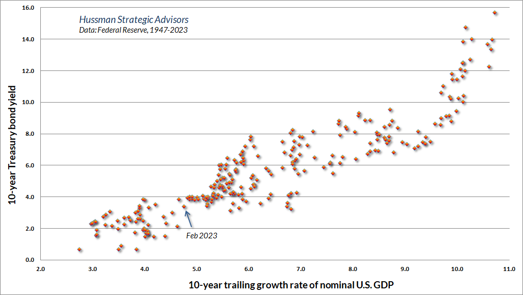
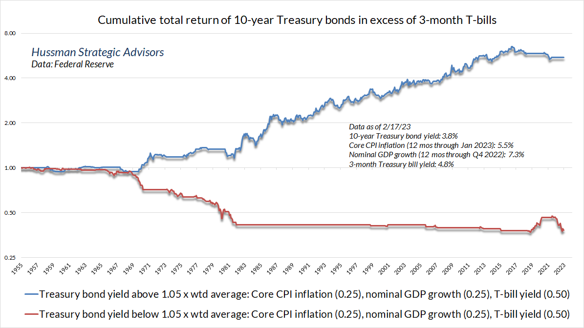
The risk, of course, is that inflation does not immediately retreat to a 2% target. On that front, the 10-year bond yield has rarely persisted below the weighted average of year-over-year nominal GDP growth (0.25 weight), core CPI inflation (0.25 weight), and Treasury bill yields (0.5 weight). Indeed, we find that the entire historical total return of Treasury bonds, in excess of Treasury bill returns, has occurred in periods when the Treasury bond yield was materially above that weighted average. It’s not impossible for bonds to do well when yields are inadequate, as we saw between early-2019 and March 2020. But then, that was a point when the economy was slowing, with core PCE inflation just below 2% – the Fed even had the audacity to describe higher inflation as a “goal” – followed by the sudden crisis of a pandemic that was accompanied by a doubling in the Fed’s balance sheet.
Geek’s note
If you don’t like math, run.
My hope is that you’ll grab a pen, a notepad, and a calculator instead. Some of the content below may be familiar, but the new portions will provide a deeper understanding of how valuations and subsequent market returns are related.
I’ll begin this section with a series of familiar propositions, most which we’ve demonstrated in various charts above.
- Every security is a claim on some stream of future cash flows that investors expect to be delivered over time. The higher the price you pay for a given stream of future cash flows, the lower your long-term rate of return. The lower the price you pay for a given stream of future cash flows, the higher your long-term rate of return.
- Low interest rates can encourage high stock market valuations, but those high stock market valuations are also typically followed by low subsequent stock market returns.
- Investors typically anchor the level of Treasury bond yields based on the trailing 10-year growth rate of nominal GDP.
- Every valuation ratio, whether price/earnings, price/revenues, price/dividend, or price/cash flow, is just shorthand for a proper discounted cash flow analysis. The thing that makes a good valuation ratio is a denominator that’s representative and proportional to that long-term stream of future cash flows.
Long-term followers may have noticed that I sometimes use arithmetic to estimate the average return over some limited holding period of T years, given certain assumptions about growth in fundamentals and ending valuations. Yet more generally, our projections of 10-12 year S&P 500 total returns simply use the log value of starting valuations. Log valuations? Nominal returns? Come on, what’s going on there?
Ok. Here’s what’s going on. Let’s do some arithmetic (yay!).
To be very general about valuations, we can use the letter F as our fundamental, which might be earnings, revenues, book value, or whatever you wish. We’ll use P for price. Our valuation ratio is then V = P/F. We’ll use the letter g as the annual growth rate of fundamentals between today and some future data T years from now. So F_future = F_today * (1+g)^T.
With that, we can write the ratio of the future price to the current price as:
P_future/P_today = { (P_future/F_future) * F_future } / { (P_today/F_today) * F_today}
This can be rearranged as:
P_future/P_today = V_future/V_today x (1+g)^T
You can annualize this by raising both sides to the power (1/T) and subtracting 1. As I detailed in Making Friends with Bears Through Math, the annualized capital gain for the security can be written precisely as:
Average annual capital gain = (1+g) x (V_future / V_today)^(1/T) – 1
The annualized total return just adds dividends. While there will sometimes be very small differences due to compounding and reinvestment, the average dividend yield over the investment horizon is generally accurate:
Average annual total return = (1+g) x (V_future / V_today)^(1/T) – 1 + average dividend yield
Let’s try some examples.
From October 1990 to September 2000, the growth rate of S&P 500 revenues averaged 4% annually. The price revenue ratio started that period at 0.7 and ended at 2.3. The average dividend yield was 3.3%. What was the annual total return of the S&P 500 over that 10-year period?
(1.04) x (2.3/0.7)^(1/10) – 1 + .033 = 20.4% annually
From September 2000 to September 2010, the growth rate of S&P 500 revenues averaged 2.7% annually. The price revenue ratio started that period at 2.3 and ended at 1.2. The average dividend yield was 2.5%. What was the annual total return of the S&P 500 over that 10-year period?
(1.027) x (1.2/2.3)^(1/10) – 1 + .025 = -1.3% annually
All of this is true for any fundamental F you choose. The question of what makes one fundamental better than another comes down to a) how representative that fundamental is of the very, very long-term cash flows that stocks will throw off to investors over time –that’s what makes a valuation multiple meaningful and well-behaved, and b) how smooth and predictable its long-term growth rate is.
Notice that the arithmetic above isn’t a theory. It’s just math. If I choose V_today as the price/revenue multiple of the S&P 500, near 2.4, and I ask what would happen if the multiple retreats to 1.5 in the next 5 years (still above its historical norm of about 1.0), and S&P 500 revenue growth averages 5% annually (higher than its average, including the benefit of stock buybacks, over the past two decades), and the dividend yield averages 2% (higher than the present index yield), my 5-year total return estimate is just arithmetic:
(1.05)*(1.5/2.4)^(1/5)-1+.02 = -2.42% annually
One can choose different inputs, but one can’t choose different math. The estimated total return is the sum of capital gains and income, and the rest is just arithmetic.
We often offer estimates of likely 10-12 year S&P 500 nominal total returns based solely on starting log valuations. Where did the other terms go? Why log valuations? Why nominal? Why 10-12 years?
Let’s go back to the capital gain term and take the natural log. A few rules. The log of a product is the sum of the logs. The log of a ratio is the difference of the logs. When you take the log of something with an exponent, the exponent pops to the front. Because compound returns involve products and exponents, logarithms are the language of compound returns.
P_future/P_today = V_future/V_today x (1+g)^T
ln(P_future/P_today) = ln(V_future) – ln(V_today) + T*ln(1+g)
Our capital gain comes down to three terms: future valuations, current valuations, and fundamental growth.
Here’s what’s interesting. We know, and have demonstrated, that for market- and economy-wide valuations, higher nominal growth g over a given decade is associated with higher interest rates and lower valuation multiples at the end of that decade.
In the equation above, the higher the nominal growth rate of GDP or corporate revenues over a T year horizon, whether due to inflation or to real economic growth, the higher the level of interest rates tends to be at the end of that horizon. In turn, the higher interest rates are at time T, the lower the level of valuation V_future tends to be at time T. As a result, the first and third terms of the equation above largely cancel out. The higher the third term, the lower the first. This is neither a modeling error nor a peculiar claim. It’s systematic and unsurprising.
That leaves the second term. Specifically, we find that nominal market returns are essentially linear in log starting valuations, with a negative sign of course. Higher valuations imply lower subsequent returns. Moreover, since higher valuation multiples are associated with lower dividend yields, the second term is also informative about the income component of total return. Simply put, starting valuations exert an enormous impact on subsequent returns, by affecting likely capital gains as well as expected income.
Our valuation work is often assailed as some sort of nefarious data mining exercise, yet the fact is that our total return projections for the S&P 500 typically reflect simple, log-linear, single-variable estimates. No data mining, curve-fitting, or multivariate regression is required. We use log valuations because that’s how present value works. The relationship between prices and returns involves terms that have exponents. We’re careful with our analysis. We examine and stress-test our assumptions. But it’s not rocket science. Well, at least not always.
We do have to remember, however, that valuations in one year are typically well-correlated with valuations the next. As a result, valuations may not tell us much about near-term returns, unless market internals are pushing in the same direction. As time goes on, the “autocorrelation” between starting valuations and later valuations becomes weaker. In our total return projections, we typically use a 10-12 year horizon, because that’s the point where the “autocorrelation” between valuation measures at one point in time and another point in time drops to zero, so it’s the most reliable horizon over which extreme valuations can be expected to normalize.
All of this arithmetic is why, across a century of market cycles, the 10-12 year total return of the S&P 500 has been strongly correlated with the log valuations at the beginning of the investment horizon, and why that relationship has remained robust even in periods where nominal growth and ending valuations have varied quite a bit. We could certainly get precise return projections if we knew future valuations and growth rates, because we could do basic arithmetic. Still, these total return projections have generally been reliable even when ending valuations were nowhere near their historical norms.
For example, the rich valuations of early 1972 correctly anticipated below-average S&P 500 total returns even though growth in nominal GDP and corporate revenues was quite strong over the following decade. That’s because the investment horizon ended at depressed levels due to high interest rates in 1982. In this case, high nominal growth contributed to total return, but low ending valuations reduced it. The first and third terms canceled out. One didn’t need to predict inflation at all. One can certainly try to use valuations to project real returns, but it’s more reliable to project nominal returns and then simply subtract your estimate of likely inflation.
Across a century of market cycles, we find that large “errors” in our return projections typically emerge only when ending valuations are unusually extreme, representing bubble peaks or secular valuation lows. We can’t rule out those “errors,” but as noted earlier, the errors themselves are very informative, because they are typically resolved by sharp reversion toward more normal valuations.
With regard to the valuation “error” we observed during the recent bubble, the retreat has been underway since early 2022. The peak of this bubble featured valuations that, on our most reliable measures, exceeded the extremes of 1929 and 2000. Establishing that peak required a host of supports and amplifiers, including zero-interest rates, multi-trillion-dollar pandemic deficits, favorable market internals, relentless yield-seeking speculation, and upward pressure on profit margins. My impression is that investors would do well to recognize that these features are no longer present. To expect valuations beyond 1929 and 2000 to become the “new normal” seems more like recency bias than foresight.
As always, no forecasts are required. We’ll respond to shifts in observable market conditions as they emerge. Still, if your financial security could not tolerate severe market loss over the coming year or two, or a period of a decade or more in which stocks lag both Treasury bonds and T-bills (measured from current valuations), it may be best to make your investment plan less reliant on a new normal that was never normal in the first place.
Guest post from John Hussman from Hussman Funds:
Your Income Blueprint for 2023
Imagine seeing $5k effortlessly flowing into your bank account every month…
And most importantly, without taking big risks.
That’s what’s possible when you use the 37 income secrets I share inside,
“Unlimited Income: Replace Your Salary and Thrive in Retirement.”
For example, did you know you could DOUBLE YOUR INCOME the next time the Fed jacks up interest rates? It’s all revealed on page 38.
Just click here for access to your income blueprint for 2023.