
The CDC maintains a database called Vaccine Adverse Event Reporting System (VAERS) that tracks the problems reported by vaccine recipients. Problems range from a brief headache to sudden death, and reporting is optional, so VAERS is by design incomplete and not always easy to analyze. But the current data do seem a bit odd.
America has been vaccinating adults against seasonal flu and kids against a growing number of things for decades, generating in the process a modest but steady background noise of side effects.
Until this year, when both adverse events and deaths spiked.
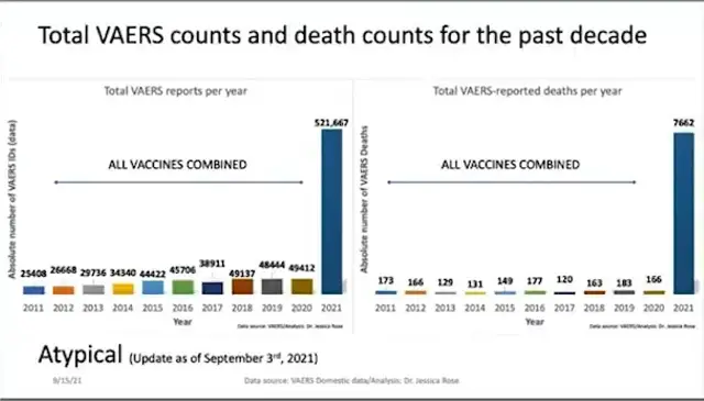
Maybe some kind of statistical quirk explains this dramatic change. For instance, a lot more people might be getting vaccinated lately, which would lead to a jump in reports even as per-capita risks remain low. Or maybe the people who compiled the above chart misunderstood the raw data.
Or maybe it’s something else. Wonder what it could be…
——————————–
SPECIAL REPORT
If the Dollar Dies, America Loses
5 thoughts on "Today’s Chart: Those Covid Vaccines Are, Um, Different"