Written by Bryan Lutz, Editor at Dollarcollapse.com:
It’s starting to become obvious, even if you’re someone who’s new to investing or macro-economics.
What’s happening in the markets isn’t normal.
Stocks are trading at 100, sometimes 200 times their valuation. And yet, corrections look like knocking off maybe 30% of a stocks valuation, but only for awhile. More money gets printed by the Federal Reserve, and then the Treasury hands it out to banks for fun and profit in the stock market.
The Money Bubble continues to grow bigger every day.
Here are three charts that show today’s markets are anything but normal:
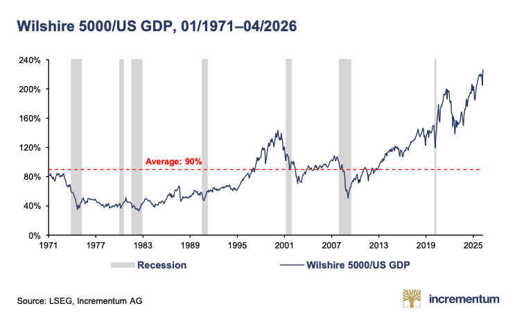
The Wilshire 5000 Total Market Index is a market-capitalization-weighted index designed to measure the performance of essentially the entire investable U.S. stock market.
Since its inception in 1971. the average sits at 90%.
Today, we’re north of 220%.
That red dashed line is what normal used to look like, back when stocks reflected the economy that produced them. Now the whole market is worth more than twice everything America makes in a year. Every recession on this chart dragged the line back toward 90%. This one hasn’t reverted.
And, since the Fed began Quantitative Easing(QE) as a solution for the Great Financial Crisis (2008), it’s just kept climbing.
Next up is the Buffett Indicator. It’s fairly well known.
If you don’t know how it measures a “normal” stock market the Buffett Indicator divides total stock market value by GDP. It shows whether the market is worth more or less than the economy producing it. Warren Buffett once called this ratio “probably the best single measure of where valuations stand.”
Today it just hit a new all-time-high at 233.9%.
Back when it crossed 100% in 2000, he warned everyone that we were playing with fire. Now we’ve more than doubled that. The market is worth nearly two and a half times the entire economy underneath it. There are no earnings stories that justifies this number. This is just the Money Bubble, inflating.
The Buffett Indicator just hit 233.9%!
Completely uncharted territory, well past every prior "danger zone" of the last half-century!!
And retail keeps buying the rip.
Euphoria at peak valuation isn't a bull signal. It's the distribution phase.
That's the top. https://t.co/dSZ3ESgUAT pic.twitter.com/Px97cAWjK7
— MidnightMess (@mdnghtmss) May 26, 2026
Lastly, we have the S&P GSCI Total Return Index
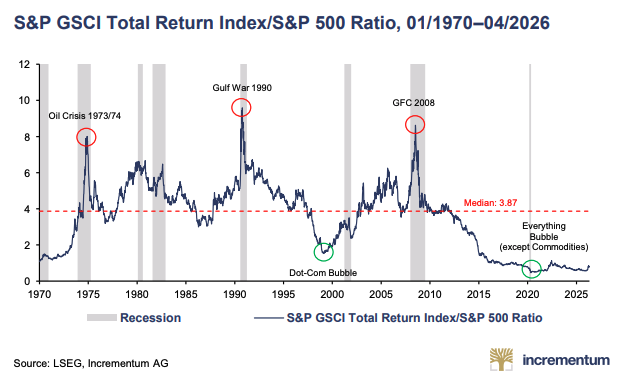
The S&P GSCI Total Return Index tracks a basket of commodities (oil, metals, grains). Dividing it by the S&P 500 shows how expensive commodities are relative to stocks: a low ratio means commodities are cheap against equities.
The median over the past 50 years is 3.87.
We’re sitting near 0.7.
Every spike on this chart is a moment when real stuff (oil, metals, grains) got expensive against paper. The Oil Crisis, Gulf War, the GFC. Then comes the green circle: the Everything Bubble, except commodities. Stocks ran. Hard assets got left for dead. That gap is the cheapest commodities have been against equities in fifty years. Yes, that special, but take a look at what’s been happening since 2015.
The ratio has been below the Dot Com Bubble low, and it’s stayed that way. Even after S&P 500 prices were brought down in 2022 as a result of increased interest rates, the ratio barely moved. The pendulum-like cycle you can see over the past 50 years is broken.
This stock market is unnatural, and when markets fight against reality they tend to eventually correct, HARD. This time, the Bubble is so big that the natural law is taking much longer to take action. When it does commodities, especially gold, and more so, SILVER, will most likely explode in a course correction the world has never seen before.